
Software
Analysis and visualization of conventional and multidimensional flow cytometry data
Last update: October 1st, 2019
In conventional flow cytometry, cell populations within a sample are identified and characterized by defining a number of regions (gates) in single and bidimensional plots.
Common tools used for flow cytometry data visualization include single-parameter histograms, bivariate plots (dotplots, box plots) and 3D representations of primary FC parameters. Such plots are used to select groups of events and identify cell populations of interest, in an expert-based subjective way(1).
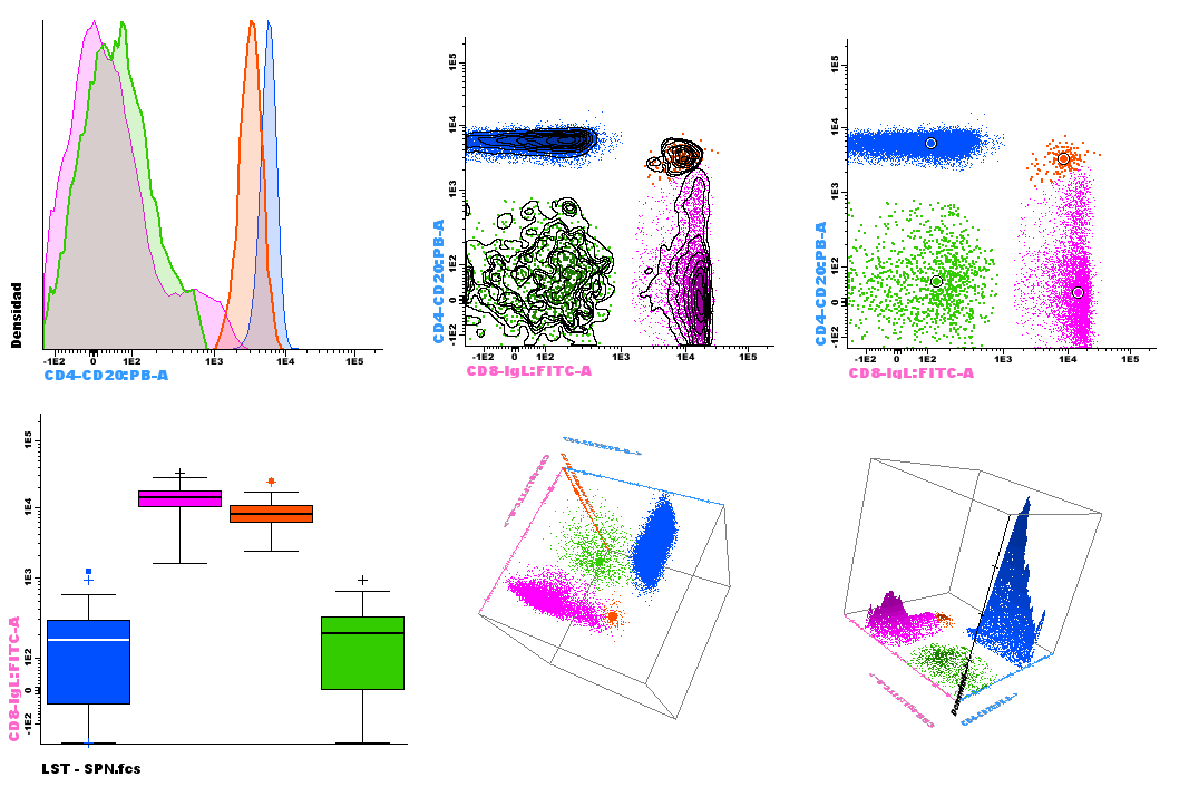
Figure 1. Classic diagrams available in Infinicyt™ Software
Identification and characterization of all major and minor cell subsets present in a given sample require instruments with progressively higher multiparameter capabilities and also the development of new algorithms and tools for data analysis and visualization. One of the approaches to overcome the multicolor limitations of flow cytometers is the staining of multiple aliquots of a sample with different combinations of markers. A few markers are repeatedly stained in each aliquot of the sample, the so-called backbone markers, to identify the same population of cells. Additional characterization markers are used for further detailed characterization.
Merging all the files allow the identification of the population of interest using the backbone markers, and also its characterization using parameter band histograms(2).
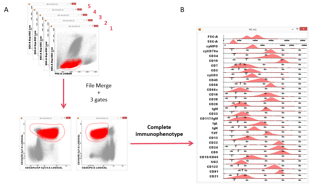
Figure 2. ALOT (screening tube) + BCP-ALL panel. Infinicyt™ allows merging several files and analyze all of them at the same time. (A) Identification of the population of interest using common backbone markers and (B) characterization of the population using the characterization markers and parameter band histogram. (Software of analysis: Infinicyt™).
Other multivariate approach for data analysis is the Principal Component Analysis (PCA), that uses the information from all the parameters included in the file providing the best cell cluster separation and highlighting the markers that are most significant for this separation.
In PCA, the first principal component (PC1) accounts for as much as possible of the variability in the data. Each of the subsequent components explains the maximum of the remaining variability. PC1 plotted VS. PC2 contains maximum information about the variability of FC data represented in such a 2D space (3).
Infinicyt™ includes the PCA approach in the Automatic Population Separator (APS) diagram.
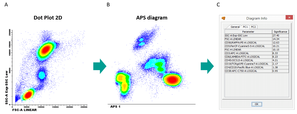
Figure 3. Same sample is represented in a (A) FSC-A VS SSC-A dotplot and 3 populations can be identified, whereas in a (B) APS diagram that considers all parameters at the same time, 7 populations can be identified. (C) The diagram window associated to the APS diagram, shows the contribution of each marker to the separation of the 7 populations.
Resources
Publications:
- Pedreira CE, et al. From big flow cytometry datasets to smart diagnostic strategies: The EuroFlow approach. J Immunol Methods. 2019 Jul; 12:112631. Go to publication.
- Pedreira CE, et al. Overview of clinical flow cytometry data analysis: recent advances and future challenges. Trends in Biotechnology. 2013 Jul; 31(7):415-25. Go to publication.
- Pedreira CE, et al. Generation of flow cytometric data files with a potentially infinite number of dimensions. Cytometry A. 2008 Sep; 73(9):834–46. Go to publication.
- Kalina T, et al. EuroFlow standardization of flow cytometer instrument settings and immunophenotyping protocols. Leukemia. 2012 Sep; 26: 1986–2010. Go to publication.